


micromodalの特徴
- 1.9KBと軽量のライブラリ
- WAI-ARIAガイドラインに準拠
- 最小限の構成でmodal dialogを作成できる
- 背景クリック、escボタンを押下、または閉じるボタン押下でモーダルを閉じる
- モーダルでaria-hidden属性を切り替える
- モーダルが開いているときに背景を固定させるのが容易
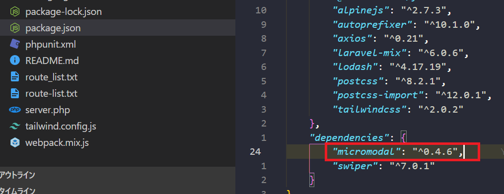
micromodalのインストール
インストールコマンド
npm install micromodal --save //via npm
yarn add micromodal --save    //via yarn
CDN
<script src="https://unpkg.com/micromodal/dist/micromodal.min.js"></script>
micromodalの使い方
CDNで実装する方法とインストールして実装する方法どちらもご紹介いたします。
1.CDNで実装する方法
こちらのサイトからcssとhtmlのサンプルがあるので、コピーする。
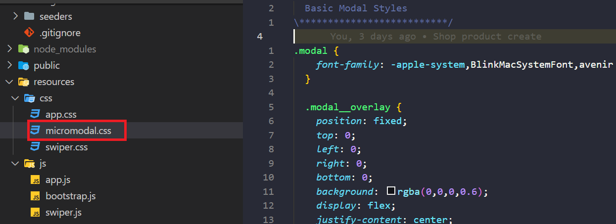
micromodal.css

「Raw」をクリックして、cssを全てコピーします。
.modal {
  font-family: -apple-system,BlinkMacSystemFont,avenir next,avenir,helvetica neue,helvetica,ubuntu,roboto,noto,segoe ui,arial,sans-serif;
}

.modal__overlay {
  position: fixed;
  top: 0;
  left: 0;
  right: 0;
  bottom: 0;
  background: rgba(0,0,0,0.6);
  display: flex;
  justify-content: center;
  align-items: center;
}

.modal__container {
  background-color: #fff;
  padding: 30px;
  max-width: 500px;
  max-height: 100vh;
  border-radius: 4px;
  overflow-y: auto;
  box-sizing: border-box;
}

.modal__header {
  display: flex;
  justify-content: space-between;
  align-items: center;
}

.modal__title {
  margin-top: 0;
  margin-bottom: 0;
  font-weight: 600;
  font-size: 1.25rem;
  line-height: 1.25;
  color: #00449e;
  box-sizing: border-box;
}

.modal__close {
  background: transparent;
  border: 0;
}

.modal__header .modal__close:before { content: "\2715"; }

.modal__content {
  margin-top: 2rem;
  margin-bottom: 2rem;
  line-height: 1.5;
  color: rgba(0,0,0,.8);
}

.modal__btn {
  font-size: .875rem;
  padding-left: 1rem;
  padding-right: 1rem;
  padding-top: .5rem;
  padding-bottom: .5rem;
  background-color: #e6e6e6;
  color: rgba(0,0,0,.8);
  border-radius: .25rem;
  border-style: none;
  border-width: 0;
  cursor: pointer;
  -webkit-appearance: button;
  text-transform: none;
  overflow: visible;
  line-height: 1.15;
  margin: 0;
  will-change: transform;
  -moz-osx-font-smoothing: grayscale;
  -webkit-backface-visibility: hidden;
  backface-visibility: hidden;
  -webkit-transform: translateZ(0);
  transform: translateZ(0);
  transition: -webkit-transform .25s ease-out;
  transition: transform .25s ease-out;
  transition: transform .25s ease-out,-webkit-transform .25s ease-out;
}

.modal__btn:focus, .modal__btn:hover {
  -webkit-transform: scale(1.05);
  transform: scale(1.05);
}

.modal__btn-primary {
  background-color: #00449e;
  color: #fff;
}

/**************************\
  Demo Animation Style
\**************************/
@keyframes mmfadeIn {
    from { opacity: 0; }
      to { opacity: 1; }
}

@keyframes mmfadeOut {
    from { opacity: 1; }
      to { opacity: 0; }
}

@keyframes mmslideIn {
  from { transform: translateY(15%); }
    to { transform: translateY(0); }
}

@keyframes mmslideOut {
    from { transform: translateY(0); }
    to { transform: translateY(-10%); }
}

.micromodal-slide {
  display: none;
}

.micromodal-slide.is-open {
  display: block;
}

.micromodal-slide[aria-hidden="false"] .modal__overlay {
  animation: mmfadeIn .3s cubic-bezier(0.0, 0.0, 0.2, 1);
}

.micromodal-slide[aria-hidden="false"] .modal__container {
  animation: mmslideIn .3s cubic-bezier(0, 0, .2, 1);
}

.micromodal-slide[aria-hidden="true"] .modal__overlay {
  animation: mmfadeOut .3s cubic-bezier(0.0, 0.0, 0.2, 1);
}

.micromodal-slide[aria-hidden="true"] .modal__container {
  animation: mmslideOut .3s cubic-bezier(0, 0, .2, 1);
}

.micromodal-slide .modal__container,
.micromodal-slide .modal__overlay {
  will-change: transform;
}
micromodal.html

cssと同様にhtmlも「Raw」をクリックして、htmlをまるっとコピーします。
  <div class="modal micromodal-slide" id="modal-1" aria-hidden="true">
    <div class="modal__overlay" tabindex="-1" data-micromodal-close>
      <div class="modal__container" role="dialog" aria-modal="true" aria-labelledby="modal-1-title">
        <header class="modal__header">
          <h2 class="modal__title" id="modal-1-title">
            Micromodal
          </h2>
          <button class="modal__close" aria-label="Close modal" data-micromodal-close></button>
        </header>
        <main class="modal__content" id="modal-1-content">
          <p>
            Try hitting the <code>tab</code> key and notice how the focus stays within the modal itself. Also, <code>esc</code> to close modal.
          </p>
        </main>
        <footer class="modal__footer">
          <button class="modal__btn modal__btn-primary">Continue</button>
          <button class="modal__btn" data-micromodal-close aria-label="Close this dialog window">Close</button>
        </footer>
      </div>
    </div>
  </div>
<h2>タグと<p>タグ内のテキストや<button>のテキストは、適宜日本語のテキストに変更します。
スクリプトタグ
以下のようなscriptタグを用意します。
<script>
  MicroModal.init({
   disableScroll: true,
  });
</script>
メイン画面でモーダルウィンドウを表示する用のボタンを用意します。
<!-- 開くボタン -->
<div class="wrapper">
  <button data-micromodal-trigger="modal-1" href="javascript:;" class="modal__btn">モーダルを開く</button>
</div>
modal-1がmicromodal.html(モーダルウィンドウ)のidと紐づいています。
完成版
<!DOCTYPE html>
<html lang="ja">
<head>
  <meta charset="UTF-8">
  <meta http-equiv="X-UA-Compatible" content="IE=edge">
  <meta name="viewport" content="width=device-width, initial-scale=1.0">
  <title>Document</title>
  <script src="https://unpkg.com/micromodal/dist/micromodal.min.js"></script>
</head>
<body>
<!-- 開くボタン -->
<div class="wrapper">
  <button data-micromodal-trigger="modal-1" href="javascript:;" class="modal__btn">モーダルを開く</button>
</div>

<div class="modal micromodal-slide" id="modal-1" aria-hidden="true">
  <div class="modal__overlay" tabindex="-1" data-micromodal-close>
    <div class="modal__container" role="dialog" aria-modal="true" aria-labelledby="modal-1-title">
      <header class="modal__header">
        <h2 class="text-xl text-gray-700" id="modal-1-title">
          モーダルウィンドウ
        </h2>
        <button class="modal__close" aria-label="Close modal" data-micromodal-close></button>
      </header>
      <main class="modal__content" id="modal-1-content">
        <p>
          サンプルモーダルウィンドウ情報
        </p>
      </main>
      <footer class="modal__footer">
        <button type="button" class="modal__btn" data-micromodal-close aria-label="Close this dialog window">閉じる</button>
      </footer>
    </div>
  </div>
</div>

<script>
  MicroModal.init({
    disableScroll: true,
  });
</script>

<style type="text/css">
.modal {
  font-family: -apple-system,BlinkMacSystemFont,avenir next,avenir,helvetica neue,helvetica,ubuntu,roboto,noto,segoe ui,arial,sans-serif;
}

.modal__overlay {
  position: fixed;
  top: 0;
  left: 0;
  right: 0;
  bottom: 0;
  background: rgba(0,0,0,0.6);
  display: flex;
  justify-content: center;
  align-items: center;
}

.modal__container {
  background-color: #fff;
  padding: 30px;
  max-width: 500px;
  max-height: 100vh;
  border-radius: 4px;
  overflow-y: auto;
  box-sizing: border-box;
}

.modal__header {
  display: flex;
  justify-content: space-between;
  align-items: center;
}

.modal__title {
  margin-top: 0;
  margin-bottom: 0;
  font-weight: 600;
  font-size: 1.25rem;
  line-height: 1.25;
  color: #00449e;
  box-sizing: border-box;
}

.modal__close {
  background: transparent;
  border: 0;
}

.modal__header .modal__close:before { content: "\2715"; }

.modal__content {
  margin-top: 2rem;
  margin-bottom: 2rem;
  line-height: 1.5;
  color: rgba(0,0,0,.8);
}

.modal__btn {
  font-size: .875rem;
  padding-left: 1rem;
  padding-right: 1rem;
  padding-top: .5rem;
  padding-bottom: .5rem;
  background-color: #e6e6e6;
  color: rgba(0,0,0,.8);
  border-radius: .25rem;
  border-style: none;
  border-width: 0;
  cursor: pointer;
  -webkit-appearance: button;
  text-transform: none;
  overflow: visible;
  line-height: 1.15;
  margin: 0;
  will-change: transform;
  -moz-osx-font-smoothing: grayscale;
  -webkit-backface-visibility: hidden;
  backface-visibility: hidden;
  -webkit-transform: translateZ(0);
  transform: translateZ(0);
  transition: -webkit-transform .25s ease-out;
  transition: transform .25s ease-out;
  transition: transform .25s ease-out,-webkit-transform .25s ease-out;
}

.modal__btn:focus, .modal__btn:hover {
  -webkit-transform: scale(1.05);
  transform: scale(1.05);
}

.modal__btn-primary {
  background-color: #00449e;
  color: #fff;
}

.modal__btn {
width: 200px;
border: 1px solid #ccc;
border-radius: 4px;
text-align: center;
padding: 12px;
margin: 16px auto 0;
--tw-bg-opacity: 1;
background-color: rgba(245, 158, 11, var(--tw-bg-opacity));
color: white;
}

.wrapper {
width: 100%;
height: 1300px;
display: flex;
flex-wrap: wrap;
align-items: center;
justify-content: center;
}

/**************************\
  Demo Animation Style
\**************************/
@keyframes mmfadeIn {
    from { opacity: 0; }
      to { opacity: 1; }
}

@keyframes mmfadeOut {
    from { opacity: 1; }
      to { opacity: 0; }
}

@keyframes mmslideIn {
  from { transform: translateY(15%); }
    to { transform: translateY(0); }
}

@keyframes mmslideOut {
    from { transform: translateY(0); }
    to { transform: translateY(-10%); }
}

.micromodal-slide {
  display: none;
}

.micromodal-slide.is-open {
  display: block;
}

.micromodal-slide[aria-hidden="false"] .modal__overlay {
  animation: mmfadeIn .3s cubic-bezier(0.0, 0.0, 0.2, 1);
}

.micromodal-slide[aria-hidden="false"] .modal__container {
  animation: mmslideIn .3s cubic-bezier(0, 0, .2, 1);
}

.micromodal-slide[aria-hidden="true"] .modal__overlay {
  animation: mmfadeOut .3s cubic-bezier(0.0, 0.0, 0.2, 1);
}

.micromodal-slide[aria-hidden="true"] .modal__container {
  animation: mmslideOut .3s cubic-bezier(0, 0, .2, 1);
}

.micromodal-slide .modal__container,
.micromodal-slide .modal__overlay {
  will-change: transform;
}
</style>
</body>
</html>
<head>タグ内でCDNを読み込み、<body>タグ内でモダールウィンドウ表示用のボタンとモーダルウィンドウの<div>タグを設定しています。
また<scriptタグ>を追加して、<style>タグにコピーしたcssを張り付けています。
※ボタンテキスト等は適宜変更して、CSSも色などを少し変えています。
追加したCSS
.modal__btn {
width: 200px;
border: 1px solid #ccc;
border-radius: 4px;
text-align: center;
padding: 12px;
margin: 16px auto 0;
--tw-bg-opacity: 1;
background-color: rgba(245, 158, 11, var(--tw-bg-opacity));
color: white;
}
.wrapper {
width: 100%;
height: 1300px;
display: flex;
flex-wrap: wrap;
align-items: center;
justify-content: center;
}
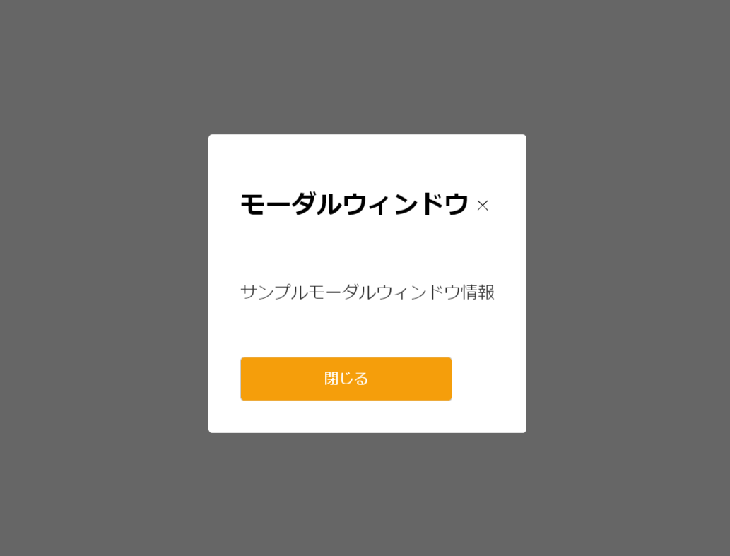
htmlをブラウザで表示すると、以下のようにボタンのみ表示されます。
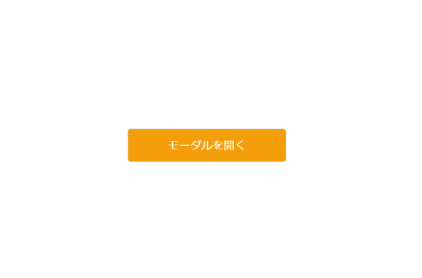
ボタンを押すとmodal window(モーダルウィンドウ)が表示されます。
2.インストールから実装する方法
フレームワークはlaravel 8を利用します。
node.jsはインストール済みでnpmコマンドを使えることを前提とします。
npmでインストール後、package.jsonにバージョン情報が記載されていればOKです。
micromodal.cssの用意
cssファイルを用意して、CDNのときと同様にcssを全て作成したファイル内に張り付けます。
cssを読み込めるように、app.cssに@import ‘micromodal’; を追加します。

javascriptの記載追加
laravelでは以下のようにbootstrap.jsにスクリプトの記載をしてmicromodalを使えるようにします。

import MicroModal from 'micromodal';
MicroModal.init({
    disableScroll: true
});
ビューの用意
<x-app-layout>
  <x-slot name="header">
    <h2 class="font-semibold text-xl text-gray-800 leading-tight">
      {{ __('micromodal') }}
    </h2>
  </x-slot>

  <div class="py-12">
    <div class="max-w-7xl mx-auto sm:px-6 lg:px-8">
      <div class="bg-white overflow-hidden shadow-sm sm:rounded-lg">
        <div class="p-6 bg-white border-b border-gray-200">
           You're logged in!
          <div class="wrapper">
             <button data-micromodal-trigger="modal-1" href="javascript:;" class="modal__btn">モーダルを開く</button>
          </div>
        </div>
      </div>
    </div>
  </div>
  <div class="modal micromodal-slide" id="modal-1" aria-hidden="true">
    <div class="modal__overlay" tabindex="-1" data-micromodal-close>
      <div class="modal__container" role="dialog" aria-modal="true" aria-labelledby="modal-1-title">
        <header class="modal__header">
          <h2 class="modal__title" id="modal-1-title">
            モーダルウィンドウ
          </h2>
          <button class="modal__close" aria-label="Close modal" data-micromodal-close></button>
        </header>
        <main class="modal__content" id="modal-1-content">
          <p>
            サンプルモーダルウィンドウ情報
          </p>
        </main>
        <footer class="modal__footer">
          <button class="modal__btn modal__btn-primary">Continue</button>
          <button class="modal__btn" data-micromodal-close aria-label="Close this dialog window">Close</button>
        </footer>
      </div>
    </div>
  </div>
</x-app-layout>
laravelインストール時にあるdashboardのviewテンプレート(dashboard.blade.php)をベースにモーダル表示用のボタンとモーダルが表示されたときの<div>タグを記載します。
ルーティングの設定
Route::get('/micromodal', function () {
  return view('micromodal');
})->middleware(['auth', 'verified'])->name('micromodal');
/micromodalにアクセスしたときに、view(micromodal.blade.php)に返すルート設定をします。(middlewareは認証しているかチェック)

CDNのときと同じようにボタンを押すとモーダルウィンドウが表示されます。

またlaravel8ではモーダルウィンドウ部分をcomponent化することもできます。
呼び出し側(resources/views/micromodal.blade.php)
<x-micromodal-window />
compoent側(resources/views/components/micromodal-window.blade.php)
<div class="modal micromodal-slide" id="modal-1" aria-hidden="true">
  <div class="modal__overlay" tabindex="-1" data-micromodal-close>
    <div class="modal__container" role="dialog" aria-modal="true" aria-labelledby="modal-1-title">
      <header class="modal__header">
        <h2 class="modal__title" id="modal-1-title">
         モーダルウィンドウ
        </h2>
        <button class="modal__close" aria-label="Close modal" data-micromodal-close></button>
      </header>
      <main class="modal__content" id="modal-1-content">
        <p>
          サンプルモーダルウィンドウ情報
        </p>
      </main>
      <footer class="modal__footer">
        <button class="modal__btn modal__btn-primary">Continue</button>
        <button class="modal__btn" data-micromodal-close aria-label="Close this dialog window">Close</button>
      </footer>
    </div>
  </div>
</div>
挙動は、componentに分離する前と同じです。
オプション
いくつか使えそうなオプションを紹介します。
| オプション | 型 | 説明 |
| openClass | string | モーダルが開くときに付与されるclass名。デフォルト設定はis-open。 |
| disableScroll | boolean | trueのときモーダルが開いているとき、ページをスクロールさせない。 |
| awaitOpenAnimation | boolean | cssアニメーションを使ってモーダルを開く場合はtrueにする。 |
| awaitCloseAnimation | boolean | cssアニメーションを待たずにモーダルを閉じる場合はfalseにする。 |
その他のオプションについてはこちらを参考にして下さい。
